Five of The World’s Ugliest Buildings
Beauty is in the eye of the beholder, though that is not always true for some buildings when we’re forced to ask ourselves what the designers and architects were trying to achieve. Here are some of the world’s ugliest buildings according to architects – though perhaps we can learn to appreciate them for the innovation and design trendsetting.
Portland Municipal Services Building, USA

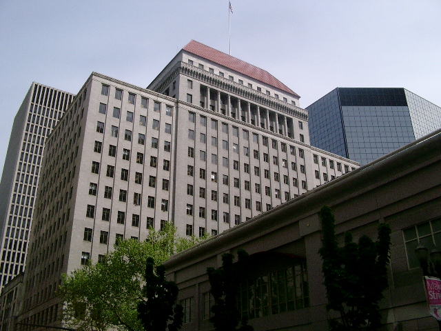
Public Service Building – Portland Oregon
Labelled by many as “America’s most hated building”, it’s distinctive for its plain white façade, striking red contrast, cuboid shape and large number of small windows. It was supposed to lead the way in post-modern design – something that fell out of favor at the end of the 1980s, the decade in which this was built.
National Library of Minsk, Belarus

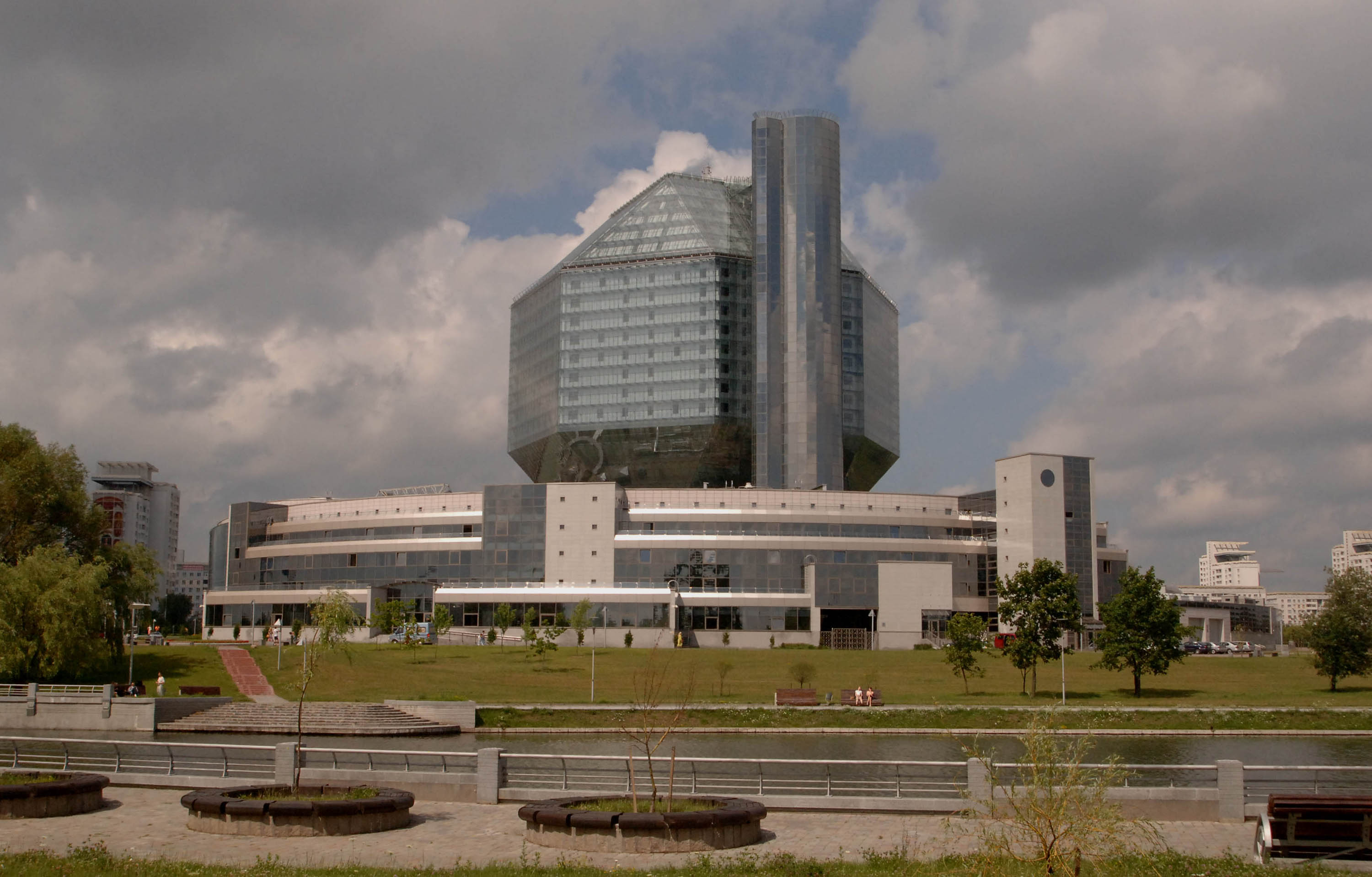
National Library of Belarus
In many western traditions, national libraries are attractive, classical buildings that reflect the center of culture and learning that we come to expect. Libraries are a place of civic and national pride. Opened in 2006, it was built in a time way after the brutalism to which it seems to pay homage. The massive diamond on top seems out of place compared to the structure of the base. It looks more like a military installation than a library.
Ryugyong Hotel, North Korea

Ryugyong Hotel
Ryugyong was supposed to be a symbol of the insular Communist state reaching out to foreign investors in the 1980s. At first glance, it could have been an attractive building and probably would be considered a postmodern curiosity in London or New York, but in the low rise skyline of Pyongyang, it dominates a little too much and looks out of place. What’s worse is that this arrowhead shaped towering construction remains incomplete. Several stop starts means it may never be finished.
Liverpool Metropolitan Cathedral, United Kingdom

Liverpool Metropolitan Cathedral, United Kingdom
Europe has a fascinating tradition of building the most astounding and awe inspiring places of worship. People travel from all over the world to see St. Peter’s in Rome and Canterbury Cathedral in England. The cultural city of Liverpool is home to perhaps the world’s least attractive place of worship. Looking more like the furnace of a steelworks, its imposing design foregoes both the cross shaped tradition familiar since the Middle Ages and the older Catholic basilica design.
Federation Square, Australia
Federation Square, Australia
This isn’t a single building, but a number of buildings within the square. Each uses a fractal façade in order to differentiate the buildings from each other while being designed on a common theme for the sake of uniformity. Easier on the eye than some of the other choices on this list, many look like fragmented glass or explosions frozen a moment after detonation.
May 27, 2015